This is a guest post by Leeni Harmainen, illustration by Alenka Kramer.
The importance of a coherent, thought-out brand and a well-functioning website for startups has been emphasised a lot lately (we also wrote about this a few times to make the point super clear). Despite the welcome hype, what remains a reality is that as a startup you don’t have the resources to make all the investments deemed necessary – in plain words, you just don’t have the cash.
With tons of free and cheap tools out there you can get a lot done for your first pilot versions of a brand and a website for very little money. You should, however, know which tools to use and which ones to avoid.
This post lists our favourite free and/or cheap tools which we can warmly recommend for startups.
For Your Website – WordPress
If you have an understanding about coding (or know someone who does), opt for this one. You can set everything up for free or select a plan with a little more freedom for editing.


What’s good about WordPress:
- Tons of free/cheap themes to use as a base for the website
- Super easy content management: you can easily add and edit content yourself
- Fall in love with the CMS of WordPress by watching this video series
- WordPress also has heaps of quality plugins you can easily add to your website
- Plugins we love to use are e.g.
- The SEO Framework for SEO management
- Zopim for online chats
- Contact Form 7 for building your own contact forms
- Polylang for multilingual sites
- Jetpack for increasing your traffic, viewing your stats, speeding up your site, and protecting yourself from hackers
- WooCommerce for turning your website into an online store
- Leadin for analytics and contact forms
- Mailpoet for newsletters
- Advanced Custom Fields for creating and editing your own custom fields
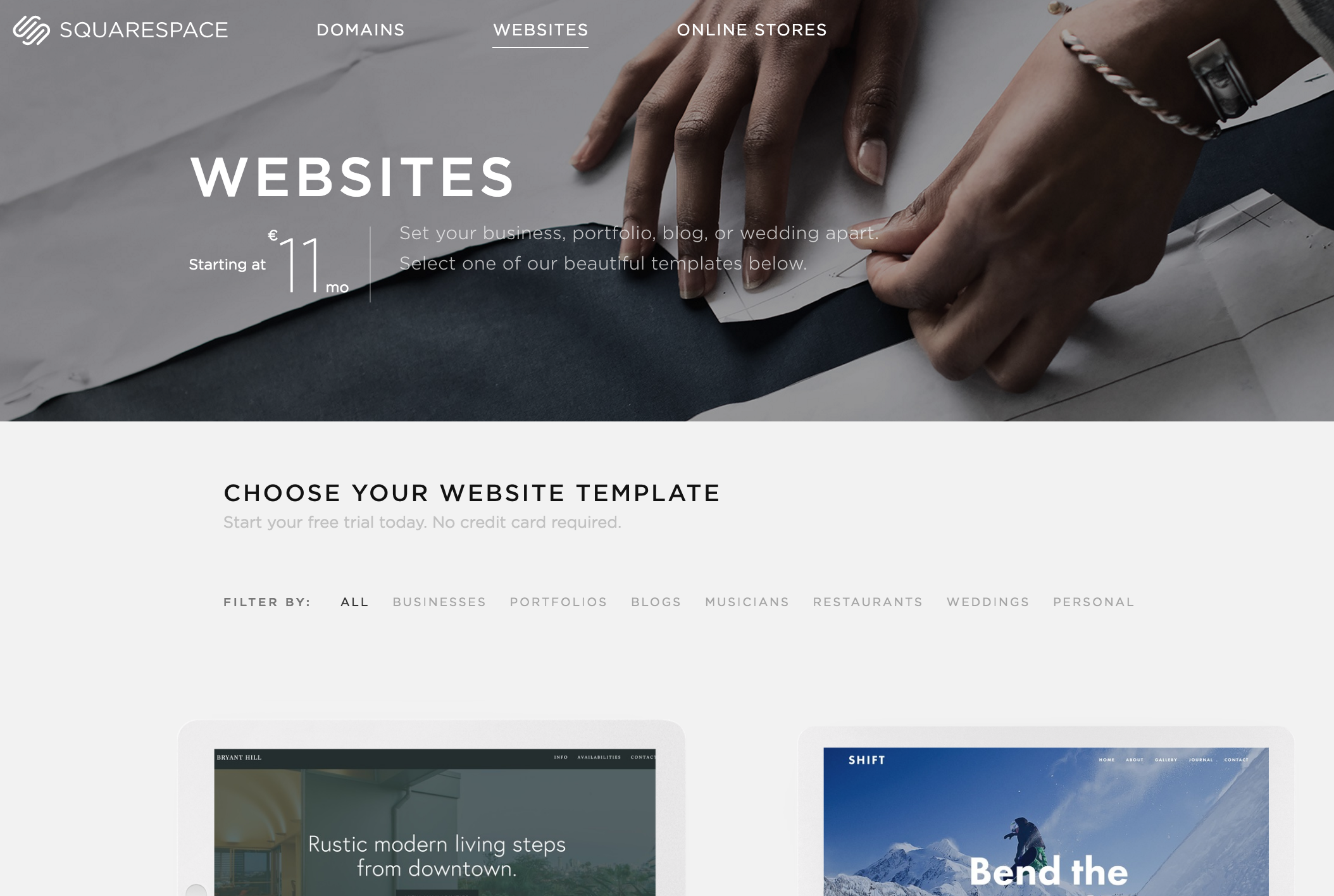
For Your Website – Squarespace
If you’re not a coder (yet), your best option is to go with Squarespace.
Setting up your website through Squarespace isn’t free, but the monthly price pays itself back quickly if you look at the time you saved not stressing about building your website.

What’s great about Squarespace:
- You need 0 coding skills to edit the site.
- You can edit your website by dragging and dropping content in the right places.
- Check out this video series for additional help 🙂
- There’s a good selection of templates to choose from
For Social Media Management – Buffer
Handling multiple social media channels simultaneously is time consuming and a lot of work. Buffer is our favourite tool for scheduling and managing the posts you send out on each channel.
With a paid version you get more tools for analysing and content ideation, but the free version is already very handy with scheduling and re-sharing the most engaging content.

For Photos – Unsplash
In general, you should avoid Stock Photos as they are never genuine and real. However, high quality Stock Photos are good for e.g. your website’s background and hero images when used right. Adobe wrote a useful article about how to use Stock Photos in the correct way, you can read it here.
For those high quality Stock Photos, check out Unsplash. You can find dozens of great pics there, like the ones below here when searching for ‘startup’ photos.

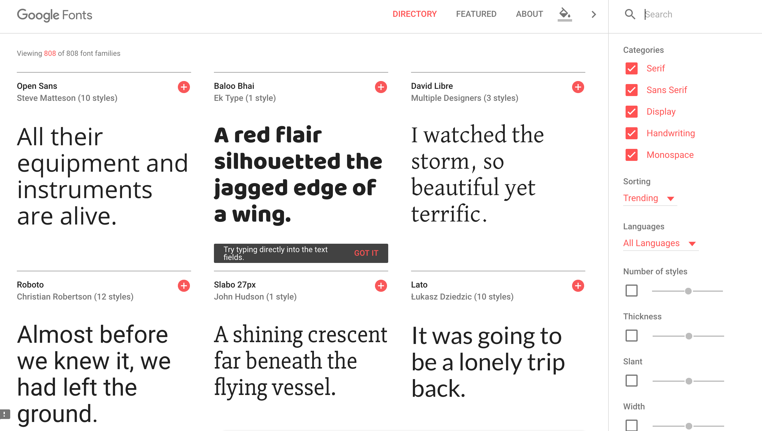
For Fonts – Google Fonts
A vital part of a credible, professional brand is the typography you use. The best resource for free fonts is Google Font.

When choosing your fonts, keep in mind these tips:
- Choose a font pair: 1 font to use in all your headings and 1 to use in your body text
- As a general rule of thumb, choose one Sans Serif font and one Serif font
Serif = A Serif font includes structural details that “dress up” the ends of the lines used to make up a letter or numeral – these elements (adornments) are called serifs.
Sans Serif = A Sans Serif font is exactly what it sounds like – a font without Serifs.

- Make sure the chosen fonts serve their purposes, think about the legibility (an informal measure of how effortless it is to distinguish one letter from another) and readability (how easily words, phrases and sections of copy can be read).
- The heading font needs to work in a bigger size – think about how long your titles usually are, how they are located in your materials and on your website
- The body font needs to be enjoyable to read – the fonts needs to work in longer chunks of text
Read more about the legibility and readability of fonts here.
For Inspiration and Examples
When working on your brand and website you sometimes get stuck with no ideas in your head. For this (very common) situation, we recommend resorting to the following inspiration sources:
- Codrops – website and creative ideas
- Dribbble – ideas and examples of websites and graphic design
- Pinterest – ideas and inspiration for everything, e.g. for picking the right kind of font pairs
- Nature – leave the dusty working space behind, go outside and breathe in some fresh air. Often we get new ideas once we give our brain some space and a new environment.
These tools are a great way to kickstart your startup’s brand and website building process. As your company grows it is wise to cooperate with experienced, professional agencies on these things as it will save you a lot of time and trouble – but before that, there’s no shame in building a few prototypes yourself.
____________________________________________________________________________
About the author:
Leeni works in our co-op, coach company booncon PIXELS, an international Experience Design Studio. The PIXELS team has been coaching the Startup Sauna teams on branding and design since the spring ’14 batch.


